File:Inequality and mortality in metro US.jpg
Inequality_and_mortality_in_metro_US.jpg (559 × 488 pixels, file size: 73 KB, MIME type: image/jpeg)
Summary
This shows death rates in metropolitan areas of the United States according to inequality of income and the average per capita income. This chart was created by Patrick Hayes using data from J. Lynch G.A. Kaplan, et al., "Income inequality and Mortality in Metropolitan Areas of the United States ," American Journal of Public Health 88 (1998): 1,074-80
I hereby release this image into the public domain.
Licensing
| I, the copyright holder of this work, hereby release it into the public domain. This applies worldwide. If this is not legally possible: |
 | This file is a candidate to be copied to Wikimedia Commons.
Any user may perform this transfer; refer to Wikipedia:Moving files to Commons for details. If this file has problems with attribution, copyright, or is otherwise ineligible for Commons, then remove this tag and DO NOT transfer it; repeat violators may be blocked from editing. Other Instructions
| ||
| |||
File history
Click on a date/time to view the file as it appeared at that time.
| Date/Time | Thumbnail | Dimensions | User | Comment | |
|---|---|---|---|---|---|
| current | 20:32, 2 December 2005 | 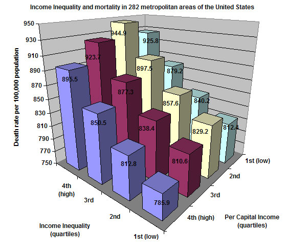 | 559 × 488 (73 KB) | Kodemizer | This shows death rates in metropolitan areas of the United States according to inequality of income and the average per capita income. This chart was created by myself using data from J. Lynch G.A. Kaplan, et al., "Income inequality and Mortality in Metro |
File usage
The following page uses this file: